Friday, April 20, 2012

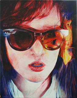
3rd Breadth


In my third breadth piece, I did a self portrait in acrylic paint. In this piece, I used a very vibrant warm colored palette with many reds and pinks and yellow hues. Because the areas of shadow are done in more cool colored tones, these areas recede, while the face, the center of interest, is brought to the forefront. Similarly, the contrast of the light area of the face and the dark area of the glasses, brings out and emphasizes the details of the glasses.  For this work, I layered two images of myself on top of each other. The second layered image helps to create some dynamic lines which add interest to the flatter areas of the work. This piece was done as an AP art class assignment in which everyone in my class created a self portrait painting which, after completion, we all placed together to demonstrate the differences in each of our respective styles. 


http://newamericanpaintings.wordpress.com/
http://lewaggoner.blogspot.com/
http://blog.the-dot.co.uk/

Monday, April 2, 2012

Breadth #2

This was a simple breadth piece I did to demonstrate my knowledge and ability to make use of line to create form. It is a contour drawing of my mother which I drew while she was helping my younger brother to write a paper.  This piece probably took about 30-45 minutes to complete.  A contour drawing is essentially just the rendering of the outlines of an subject.  A contour drawing is usually sketched from life, as mine was, and demonstrates the artist's ability to capture the life action or expression of the subject.  The expression I wanted to capture was one of deep concentration, as my mother was concentrating very hard when trying to help him with his paper!  The deliberate clean lines which I used to draw my subject help to give this piece a certain excitement and freshness.  The curving and slanting lines of the work also help give a sense of movement to an otherwise stagnant piece.

Here is the final result:

Other blogs:
http://artnotartnot.com/
http://iconoclassic.tumblr.com/
http://darksilenceinsuburbia.tumblr.com/

Sunday, March 25, 2012

Breadth #1


This is actually the third breadth piece I have completed, but I haven't uploaded the first or second yet.  The breadth section of the AP art portfolio is the section in which the artist works with different media and techniques to show the AP board their foundations and range of abilities in visual art whereas the concentration demonstrates their ability to investigate and be creative within a specific idea.   For my first breadth piece, I did a colored pencil drawing of one of my classmates (whose art blog can be found in the sidebar  at http://bland-art.blogspot.com/).   I wanted to demonstrate my understanding of foreshortening and perspective with this piece, but I also wanted to get a little creative and experiment with color.  I used one of my favorite complementary color schemes for this piece: orange and blue. The warm colors remain in the foreground while cool colors recede into the background. Therefore, I used the warm colors on the leg an the foot to draw the viewer's eye to the center of interest which is the foot.  There are several diagonal line on the leg, the window blinds, the book, and the wrinkles on the foot which create a sense of movement in this piece.  Also the repetition of the diagonal lines helps to give this work a sense of unity, as does the color scheme of orange and blue. However, to make the piece especially dynamic, I wanted to create a more dramatic sense of lighting. To do so, I brought one of the other photos I had taken in our photoshoot into photoshop and began experimenting with different settings. I eventually found on one that I liked but I could only use the edited photo as a guide for color because it was different from the photo I was actually using as a reference. Here are the two photos I used:


                  unedited                                              .  .  .                                                edited


Here is a sample of my process for this piece.
(My camera broke while I was starting this drawing so I had to resort to taking terrible, low-quality iphoto pictures for my process pictures. I apologize for his fact.)

Here is the finished piece:


Please take a look at these other great blogs too!
http://www.blogger.com/profile/06287407961296541134
http://paperimages.tumblr.com/
http://eatsleepdraw.com/


Tuesday, February 7, 2012

Concentration #10

For my 10th Concentration, I did a picture of my father. This one was really difficult because of the small details in the trees but I think it turned out fairly well. I used a balance of both large areas of light values as in the snow on the ground and large areas of dark values as on the jacket and pants and the trees in the background.  The shadows on the ground as well as the receding line of houses in the background give this piece a sense of depth.  The shadows and the house line also create converging line which direct the eye to the center of interest, which is my father.  The intricate details of the trees provide a nice textural effect for this piece and the the lines that make up the trees, pointing in various directions, give the trees and the work a sense of movement and interest, which is important in a piece that, with so many horizontal lines, could become stable and boring.
 
 8x10

Here is a sample of the process I used to complete this piece:
Here are some interesting blogs and links!
http://painternyc.blogspot.com/
http://bland-art.blogspot.com/
http://happyfamousartists.com/blog/page/3/

Monday, February 6, 2012

Concentration #9

For my ninth concentration I did a scratchboard of my mother at my grandfather's house. I think this one turned out really well because the striking lighting of the window on the room creates high contrast values that contribute to a dramatic atmosphere.  However, I also used many horizontal and vertical lines in this piece to create a peaceful, serene, almost pensive mood for this piece. Horizontal lines, like the lines of the molding on the walls, create feelings of calm and serenity.  Vertical lines, such as those on the window, give a sense of stability. I concentrated the areas of highest contrast on objects that I wanted to emphasize, such as her face, the chandelier, and the candle holder because I felt that these elements, when emphasized, added to the drama of the piece.  The other areas either had similar values or very softly contrasting values.   I once again used hatching techniques to create the values in the work and I also used the fiberglass tool to create some softer values on the floor near her feet.  
 

8x10

A Few Process Pictures

Chandelier Progress Detail

Face Progress Detail
As always, check out these other interesting blogs and artists (links in the sidebar):
http://tinymediaempire.com/
http://paintsmc.blogspot.com/
http://www.jones-terwilliger-galleries.com/Artist_Entry/opencarson.html


Also please watch this amazing 3D painting demonstration by Riusuke Fukahori!

Wednesday, January 18, 2012

Concentration #8

For my 8th Concentration piece I did a scratchboard of my uncle David. This was a piece that I actually did in my spare time last year, but it happened to fit with my concentration this year, so I  added a few things, like some of his hair and his collar, and used it as my eighth concentration piece. This piece is a little more minimal than my other pieces. I eliminated the background elements of my reference photo to draw attention my center of interest through means of isolation. This isolation helps to emphasize not only the subject but also the high contrast values of the face and the dramatic lighting in areas such as his eyes which contributes to the mood of the piece.  The photograph on which this piece is based was taken on a very sunny day in Southern California. Such a bright and sunny setting could give the piece a very happy feeling, however, I wanted the piece to have a more thoughtful mood because of the pensive expression on his face. To create this look, I chose to emphasize the darker values on the left side of his face and leave the background dark. I also eliminated many of the lighter values of his hair, including only the highlights of certain strands of hair, which keeps the emphasis on the face while allowing the implied lines created by the highlights to suggest the rest of his hair.  To create the values on his face and hair, I used hatching techniques that followed the contours of his face, using less hatching lines for darker areas and more hatching lines for lighter areas.  On certain areas of his hair, I also went over my hatching lines with a fiberglass tool to soften the marks. Originally, the subject was placed in the center of the board however, I cropped the piece to create a more interesting composition which would take the eye of the viewer away from the center of the page.  Additionally, the curve of his collar helps to bring the eye back around to the left side of the piece.
Here are the tools that I used to complete this piece:

And As always, check out these other interesting art blogs:
This last one is the fashion blog of one of my friends from the Tennessee Governor's school for the arts program. Though it is a fashion blog, not an art blog, she really treats her wardrobe like functional art and it is a really interesting and inspiring bog to look through.

Wednesday, January 4, 2012

Concentration #7

For my 7th Concentration piece, I did a colored pencil drawing of my mother. For this work, I used watercolor paper instead of the standard drawing paper that I used for my last colored pencil piece and I found that the texture of the paper absorbed the colored pencil pigment much better which allowed me to a achieve much richer color than before.  I used a complementary color scheme for this piece using mostly red-orange pigments for the highlighted areas and deep blue-green hues for the shadows.  The striped pattern on the blouse helped to create form on the shirt and also gave some good movement to a large area of the work that, if a solid color, might have become boring. The diagonal slant of my mother also creates a feeling of excitement for the work, because diagonal lines help to create interest and break up space in a work of art. I emphasized bold red orange hues, the striped pattern of the blouse and the diagonal placement of the subject because, despite the fact that my mother is lying down, I wanted to create a bright, happy, excited mood for this piece.


8.25 x 9.5

Here is a series of photos demonstrating my process for this piece,

and here is an photo of all of the various colored pencils I used to complete this piece,


and here is a list of a few new blogs I'd like to recommend (links in side bar).
http://beautifulvandalism.blogspot.com/
http://weeklyartchallenges.tumblr.com/
(this blog gives weekly art challenges and readers can submit their challenge results, which are featured on the blog)


http://artoftess.blogspot.com/